Ollie CampbellinPrototyprChris Kelly on Designing an Award-Winning Brand for Adobe LiveAdobe Live is a streaming video series where top creatives share their process. But the show had a problem - it didn't have a brand.Aug 21, 20182Aug 21, 20182
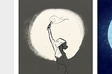
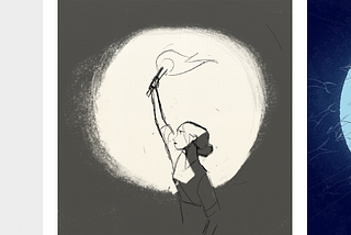
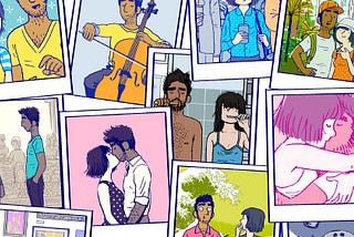
Ollie CampbellinMuzli - Design InspirationThe lead designer of Monument Valley deconstructs his latest game, FlorenceFlorence is a game where two people meet, fall in love and eventually drift apart. In this article Ken Wong shows how it was designed.Jul 9, 20187Jul 9, 20187
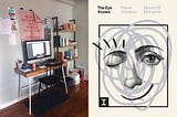
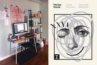
Ollie CampbellinThe Work Behind The WorkHow Frank Chimero Designs a PosterFrank Chimero's clients range from Nike to NPR. Here he takes us through his process of designing a poster, from concept to production.Jun 13, 20184Jun 13, 20184
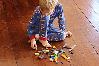
Ollie CampbellWhy using Evernote is making you less creativeI have a four year old son. And like most four year olds, he’s a creative genius. One day as I was watching him play with Lego, I finally…Jul 18, 201617Jul 18, 201617
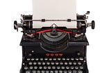
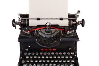
Ollie CampbellBashers & SwoopersHow the tools we use for writing are letting us down.Jul 4, 20163Jul 4, 20163
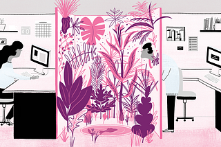
Ollie CampbellQuiet timeHow working in silence made us 23% more productive, and how you can do it too.Oct 27, 20154Oct 27, 20154
Ollie CampbellWhy the Internet is anti-design, and how you can fight back.If you’re making a digital product, you need to read this.Oct 5, 2014Oct 5, 2014
Ollie CampbellTurning data into decisionsYour users are drowning in data. Here’s how you can help.Aug 28, 2014Aug 28, 2014