From Concept to Code: Crafting an Android Audio Book App with Jetpack Compose and MVI (P-2)
Part 2: Foundation for MVI & Building Blocks of the App
Welcome to Part 2 of the series, “From Concept to Code: Crafting an Android Audio Book App with Jetpack Compose and MVI”. In this installment, we’ll dive into the foundational elements that will shape our application's core structure and visual appeal. Let’s embark on setting up base classes for MVI, use cases, and crafting reusable UI components.
Understanding the MVI
Let’s take a quick overview of Model-View-Intent (MVI) before jumping to its implementation in our app. MVI is a design pattern that has gained popularity in modern Android development. It offers a structured and reactive approach to building user interfaces, clearly separating concerns and facilitating a unidirectional data flow.
The Components of MVI
Model (ViewState): The Model represents the current state of the application. It is often referred to as
ViewState. This state is a unidirectional data flow that captures all the information needed to render the UI.
For example, to show the state of each item in the list of books on our home page, we can define the BooksListUiState model:
data class BooksListUiState(
    val id: String,
    val title: String,
    val author: String,
    val cover: String
)
Read more about defining UI state on Android official docs.
View (Composable functions): The View is responsible for rendering the UI based on the current state. In our case, Jetpack Compose is the perfect fit for building reactive UI components. Composables receive the
ViewStateand determine how to represent it on the screen.
For example, to present the BooksListUiState on UI we can write the following composable:
@Composable
private fun BookItem(book: BooksListUiState, onBookItemClick: (bookId: String) -> Unit) {
    Column(
        modifier = Modifier
            .width(109.dp)
            .clickable {
                onBookItemClick(book.id)
            }
    ) {
        BookThumbnail(
            url = book.cover,
            modifier = Modifier.fillMaxWidth().height(160.dp)
        )
        Spacer(modifier = Modifier.height(10.dp))
        Text(text = book.title, style = MaterialTheme.typography.labelLarge, maxLines = 1)
        Text(
            text = book.author, style = MaterialTheme.typography.labelSmall.copy(
                color = MaterialTheme.colorScheme.outline,
                fontWeight = FontWeight.Medium
            ),
            maxLines = 1
        )
    }
}
Intent: The Intent is a user actions or events that can trigger a state change. It serves as a bridge between the user interaction and the application’s logic.
For example in the case of our home screen, we may have “Load” and “BookItemClicked” intents.
sealed class HomeIntent {
    object Load : HomeIntent()
    data class BookItemClicked(val bookId: String) : HomeIntent()
}
//or
sealed class HomeAction {
    object Load : HomeAction()
    data class BookItemClicked(val bookId: String) : HomeAction()
}
I have used the Action term instead of Intent. So any class named with a suffix Action represents an intent.
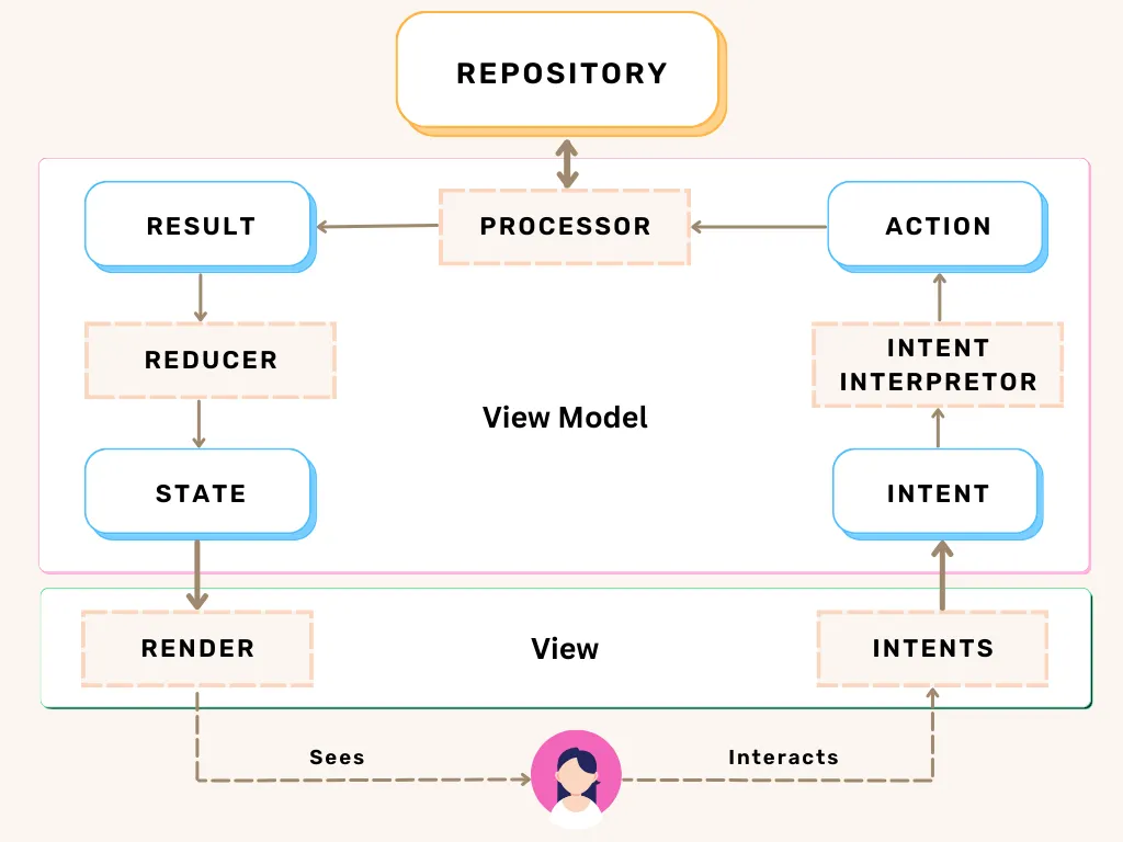
The Flow of MVI
The diagram above explains how the MVI components communicate with each other. Let’s discuss it briefly.
User Interaction: When a user interacts with the UI (e.g., clicks a button), an Intent (Action) is generated.
@Composable
fun HomeScreen(
    viewModel: HomeViewModel
) {
    //user clicks this button and Load data action (intent) is generated.
    Button(onClick = { viewModel.action(HomeAction.Load) }) {
        Text(text = "Load Data")
    }
}
ViewModel (Business Logic): This Action is passed to the ViewModel, where business logic is executed based on the received Intent.
class HomeViewModel : HomeViewModel() {
    fun HomeAction.process(): HomeResult {
        return when(this) {
            HomeAction.Load -> TODO() send an api call to fetch data
            HomeAction.ViewAllClicked -> TODO()
            is HomeAction.BookItemClicked -> TODO() navigate to detail ui
        }
    }
}
An Action always generates a Result. In the above example, HomeResult is generated by the processor.
Reducer (state generator): The Reducer generates a new State one based on the previous state and the new result received from the processor.
State Update: The updated State is then emitted to the View, triggering a re-composition of the UI.
We’ll discuss the MVI flow in more detail in the next parts when designing a screen.
Setting Up MVI Foundation
To implement the MVI architecture, we’ll establish the base classes: MviViewState, BaseStateViewModel, and MviAction (Intent), MviResult, MviEvent, and MviStateReducer. Big thanks to Ryan Simon for crafting these foundational classes and being a lifesaver.
We have placed these files under the core directory like this:

Let’s theme our app
Define Theme in Compose

When we create a new Android project with Jetpack Compose, you can see these 3 files Color.kt, Theme.kt, and Type.kt. Read the material 3 guidelines for a better understanding of theming.
Avoid using hard-coded values while coding UI. Instead use MaterialTheme to consume the defined typography, colors, and shapes.
Text(
  text = "Summary", style = MaterialTheme.typography.labelSmall.copy(
    color = MaterialTheme.colorScheme.outline,
    fontWeight = FontWeight.Medium
  ),
  maxLines = 1
)
Creating Shareable Composables
To maintain a consistent and visually appealing UI, we’ll create shareable Jetpack Compose components. These components will include buttons, cards, chips, and text elements that adhere to the theme of our application.

Navigation Graph
The application incorporates nested navigation within the bottom app bar. Kindly take a moment to peruse my previously published Medium article “Implement Nested Navigation with Bottom Appbar in Jetpack Compose” for better understanding.
Under navigation directory, check these two files AppNavGraph.kt and Route.kt to see how to manage the navigation graph in compose.

Dependencies
For now, our Audio Book app has the following dependencies but new dependencies are expected to develop new features. Please stay vigilant regarding the build.gradle file to ensure up-to-date dependencies.
See README on the Github repo to see the Tech Stack of our application.
Conclusion
By the end of Part 2, You’ve set up the MVI architecture, created reusable UI components, styled your app with a custom theme, and integrated dependencies like Jetpack Compose and Hilt, etc. In the upcoming parts, we’ll delve into specific features, enhancing the functionality and user experience of your app.
For a comprehensive overview of the project setup and introduction to the series, check out “Part 1: Introduction and Project Setup”. Stay tuned for the next installment, where we’ll tackle the implementation of the Onboarding Screen. Happy coding!
Feel free to hit me up on Instagram or Facebook.
Know more about me on waseemabbs.com, GitHub, and Linkedin