I was really excited about this project because poster-making is required for a lot of the organizations I am in and I was really fascinated to see what would draw people in and keep their attention focussed on your poster.
For the posters, I hoped to focus on silhouetting so as to make the information stand out and easy to determine at a glance. I used the following Star Wars posters as a source of inspiration, since I really like how the figures are easily recognizable yet only use a few colors.
The music festival in the posters is relatively mellow and calm so I wanted to use some cool tones on the posters but still have them be pretty different.
For the last project, I used complementary colors so for this one I wanted to have analogous colors.
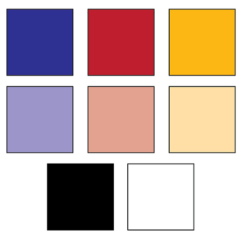
Below are 3 potential color palettes I picked.
All three involve blue and green because I think that blue and green could really strengthen A Beautiful Planet, and green would really play to the “digital” aspect of Lo and Behold. As for the red and purple, I…
This palette would be used to accentuate the Pittsburgh aspect of the event. The lighter tints would be used as the background…