The Journey into Time Series: The Future Revealed through Forecasting
Data Mastery Series — Episode 14: The Art of Forecasting (Part 5)

Connect with me for deeper insights from my experiences: linkedin.com/in/nattapong-thanngam
We’ve journeyed a long way into the realms of time series forecasting. Here’s a brief recap of the saga so far:
- Part 1: Delved into the basics of time series It covered popular forecasting algorithms, the four vital components of time series, metrics for forecasting evaluation, and types of demand patterns.
- Part 2: Introduced Descriptive Analytics, emphasizing understanding historical data and using visualizations for clarity.
- Part 3: Went deeper into descriptive analytics. Explored Measures of Centrality (Mean, Median, Mode), Variation (Range, Variance, Standard Deviation, Coefficient of Variation), Localization (Percentile, Decile, Quartile), and Symmetry (Skewness and Kurtosis) We also showcased popular Python libraries for EDA.
- Part 4: Emphasized visualizations tailored for time series forecasting with tools like line charts, box plots, heatmaps, seasonal plots, seasonal subseries plots, and seasonal decomposition plots
In this concluding episode (Part 5), I’ll outline the essential processes for sales forecasting. Note that detailing every step might require several more episodes!
Continuing our Tale


Imagine you’re Zara. How would you estimate the sales target for the next year? What techniques would you deploy? In this episode, I’ll outline my forecasting steps using PyCaret, shedding light on the intricate process of forecasting.

Zara’s coffee shop, “Robust Roast,” offers three products. For simplicity, we’ll center our discussion around SKU A.
Step 1: Deep Dive with Descriptive Analysis
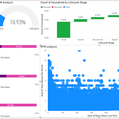
While line charts provide a glimpse into sales patterns, a profound understanding of your product leads to more accurate predictions. Key metrics to grasp include the data’s historical period (start and end dates), average sales, sales’ standard deviation, and the type of demand pattern.

For a richer exploration, tools such as the decomposition plot are essential. It uncloaks trends, seasonal shifts, and residuals in your data. By dissecting time series data, we glean the Trend (long-term patterns), Seasonality (regular oscillations), and Residuals (fluctuations post the removal of trend and seasonality). This insight illuminates data quirks and anomalies.

Step 2: Visualizing Data Splits for Training, Validation, and Testing
The Training Set molds our model, the Validation Set fine-tunes it against overfitting, and the Testing Set verifies the model’s adaptability to unseen data. For this demonstration, I’ve designated the final six months as our test set, dividing the data into six strategic folds.


Step 3: Model Selection
With so many models already included, Pycaret makes it simple to rank the top model. The assessment metric of choice is crucial; I frequently use the “RMSE.” The discrepancy between expected and actual results is measured using the metric known as Root Mean Square Error. A lower RMSE denotes greater precision, however it’s crucial to consider it in context or in comparison to other model benchmarks.

Step 4: Validation of Results
To ensure the efficacy of the chosen model, juxtapose the forecast within the training period against actual data. Furthermore, the residual diagnostic tool is invaluable and deserves attention.


Step 5: Actual Forecasting
Here, we project a 6-month and 24-month forecast using the best-suited algorithm identified in step 3.


Effective forecasting offers manifold benefits, from enhancing the accuracy of demand planning to shaping pricing strategies, optimizing inventory management, and streamlining logistics. It’s an instrumental pillar in efficient business strategies. I hope my article has helped you understand how time-series forecasting works. If you have any questions, please reach out through my page.
Thank you for accompanying me on this enlightening journey. If you found value in this read, I invite you to explore my other articles and narratives.


Please feel free to contact me. I am willing to share and exchange ideas on topics related to data science and supply chains.
Medium: medium.com/donato-story
Facebook: facebook.com/nattapong.thanngam
Linkedin: linkedin.com/in/nattapong-thanngam