In light of recent world events, I thought it would be interesting to explore what experiences people currently living in the world have had. After all, experiences play a large part in shaping our decisions and actions.
Continuing with my Twitter analysis of the debates, I streamed and analyzed tweets from the last two presidential debates and put together some visualizations comparing the results. I used BigQuery to analyze tweet data from the Cloud…
An alternative to the typical red/blue election map, this 3D version shows which candidate won each county as well as each county’s relative importance (total vote count).
Donald Trump predicted this election would be “Brexit plus plus plus.” He was right.
Just 10 days ago, prediction markets showed Trump as a 10-to-1 underdog. His projected odds among election forecasters in the media were even lower, some…
With just one day remaining in the 2016 U.S. election cycle, it’s now possible to tally up a near-final total of the last two years of campaign reporting numbers and see how spending by this year’s general election…
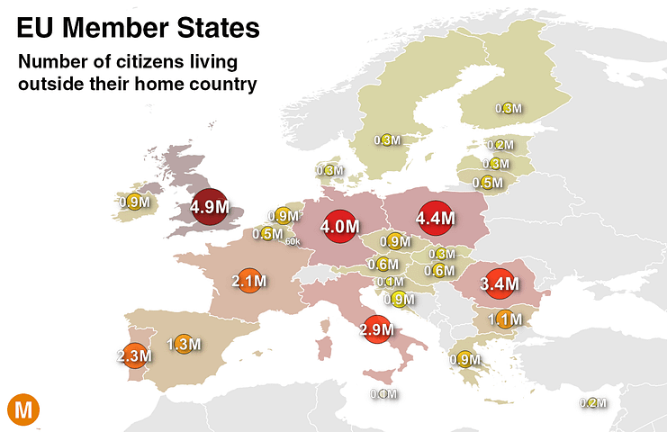
Of the 28 European Union member states, which one has the largest population living outside the country?