Finding clarity in a time of chaos: the role of the Flipboard brand today

It’s our time
Our world today is confusing, cluttered, and rapidly changing. It’s hard to keep up, to stay connected, to the world, and to ourselves. But it shouldn’t be.
Some of today’s biggest challenges at the intersection of information and technology are the very things we’ve been designing for since Day 1: filter bubbles, fake news, information overload, social media fatigue and FOMO, to name a few. We believe that Flipboard can fill a real void for people, and yes: we want to capitalize on this moment to talk about it.
Because our mission is crystal clear
We are a place you come to be a more informed colleague, parent, and citizen. A place to dive deep on the things that inspire you, and a place to inspire others who share your passion. Last year, we redesigned Flipboard to put your passions literally front and center, making it even easier to stay in tune with what matters to you. Of course, our work here is far from done, but we are heading in an important, and exciting direction.

And our principles are more resonant than ever
We’ve always applied journalistic principles in how we deliver high-quality news and stories to people. We do this through the unique mix of a world-class editorial team working with a world-class engineering team. But this past year, when we saw the rest of the world subverted by easily gamed algorithms we became more vocal about our philosophy and the importance of our approach.
So we’ve set out to make it all a bit more tangible
Eight months ago, we found partners who loved our mission and could help us tell our story. As our CMO Marci McCue led us internally to rethink the way we talk about the value that Flipboard brings, the brand design team partnered with Brent, Nate and Lindsey over at Moniker to evolve our visual identity. Last month, it all came together in our first brand campaign, which was conceived in collaboration with Rich Sullivan of Red Square.


At the outset our objective was to create a more distinct and remarkable visual identity, one with more layers that would allow us to communicate in a multidimensional way. Specifically, we wanted to build a language that would work much harder for us in highlighting the unique characteristics of Flipboard.
We also wanted something unbreakable, and timeless. In design, if you build from the center of a brand by anchoring around its core purpose, you can build a truly unique and meaningful identity. It may need a bit of a refresh every now and then, but every element will have a valuable role as long as the brand’s mission remains unchanged.
So the design team started by going back, all the way to square one. Below are some highlights of the work that we are excited to roll out this year.
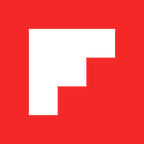
It starts with a window
Our original manifesto states “great stories move the world forward.” We believe access to high-quality content and diverse perspectives helps us make informed decisions, take action and be better world citizens. This is why our logo was conceived in 2010 as a window onto great stories, with transparent window panes at its center.


Transparency is a lovely concept, but, truth be told, it has caused our brand team some real pain over the years. Red transparency was virtually impossible to use in a consistent way and police across mediums. When used in white, it felt like more of a film than a window, and navigating screen printing and one-color solutions was a nightmare.
The full lockup was also slightly imbalanced and still married to Helvetica Neue, which had been replaced in our product’s interface over two years ago.
So this year, we reimagined the logo as a fully open window, reset our logotype using our custom Fakt Flipboard condensed, and restored balance to the lockup. Our red also got a nice refresh. We’re just a little brighter everywhere.

There was amazing potential in this window, just waiting to be tapped.

It’s about perspective
Our F becomes a distinct storytelling platform where we can feature inspiring points of view.


And, you might notice a staircase in the white space. This was a serendipitous discovery, but once we saw it, we couldn’t unsee it. Because it speaks so well to our vision of advancing the conversation, the team decided to pursue this concept in more depth.
It’s about progress
The stair led to the development of what we are calling the F Step pattern. Moniker worked with us through countless explorations on these puzzles. Where in the past we have used a grid of imagery to showcase the variety and depth of content on Flipboard, this pattern gives us the opportunity to speak to ideas more distinctly us.
What we landed on are a set of specific juxtapositions that map to our core identity.
From the macro to the micro,

local to global (self investment, to community engagement),

to strong opposing forces or different sides of a story.


It’s about drawing our line
It comes from the center square of our logo mark. One story, one square, which builds into a line that pulls you forward.


Then into an underline, a strikethrough, which allows us to tell the world what we stand for, and what we stand against.
As quote marks, It helps us highlight our voice, and voices that deserve to be heard.
As the plus sign, the ‘Flip’ button, it’s our tool that lets our audience share their point of view.
As a bracket, it can help us shine a light on unique perspectives on and off Flipboard.
And as the identity system for our editorial desks it helps us surface the invaluable curation of our editorial team.


It’s about putting a stake in the ground
As we worked through our visual identity, Marci crystallized our campaign tone and platform. With the design language set and a clear perspective on our message and audience, it was time to make a statement.
“It’s Your Time” is more than a campaign slogan. It’s a reminder that, in this attention economy, you can control how you spend your time and put it to good use. On Flipboard, it’s YOUR time.
— Marci
We knew we had a strong brand platform with “It’s Your Time,” but there were countless ways to introduce it. There is no magical formula for how to launch a brand platform. You have to be tenacious and willing to write through dozens of directions and ideas — stress test language, torpedo the not-so-great ideas and refine the good bits. You simply have to write and write and write.
Red Square presented hundreds of pieces of writing — long form, short form, more literal, more anthemic — in the end, the team gravitated to the least likely suspect: a short paragraph with all the words struck through, save ‘It’s Your Time’. Though we may have overlooked it on the first go, as we circulated the ideas with our teams, it garnered the most attention.


This is us literally editing out the things we won’t stand for.
We think it feels visceral and provocative. There is a hard visual tension that makes you a bit uneasy, but it’s hard to look away.
“It’s been my experience that the best sign you’re working with a good idea is that it makes people a little nervous. The ads don’t look like conventional ads. They don’t sound like a typical manifesto either. No product shot. No visuals. Just thirty bold words, all struck through but three.”
— Rich


The first phase of the campaign is a set of 3 long form executions and 5 short statements that together, form the foundation of a conversation about what we value, and the current challenges that we are actively tackling as a company. It’s now running as full page print placements and across the web.
Finally, our new identity is already making an appearance across our different experiences, and inspiring new ideas on how to tell the many parts of our story in 2018 and beyond.
Thank you to all involved for your tireless creativity.
Ashleigh and Ben from
The Brand Design Team,
Oh, and we are looking for brand designers passionate about informing and inspiring the world. If you’d like to join the team please get in touch.