The charts are more meaningful when they have axes around them. The axes tell the quantity of a particular datum represented on the plane. This a how-to-post to create the axes around a D3 chart.
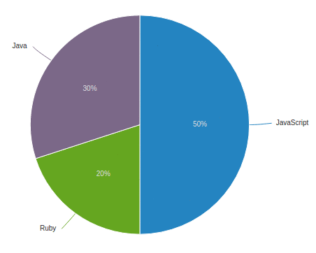
“D3pie is a simple, highly configurable script built on d3.js for creating simple…
In our previous blog post we saw how to create a simple histogram based on data. But still our chart is not ideal chart as the range of data in array can vary from too small to very large numbers that might not fit in our SVG canvas created by D3 for e.g. in our last blog…
D3.js is a javascript library to render the amazing charts based on data. It can be used to visualise the stats and finding the patterns, showing the comparison between two or more time-series data, drawing the data in real time as it happens (for e.g. data generated by various sensors or…
In this blog, we will learn using D3 chart with AngularJS. We will use D3 by injecting it in our angular application.
Introduction of D3 Chart:- D3.js is a JavaScript library for manipulating documents based on data. D3 helps you bring data to life…