InData Visualization, Data Science and PythonbyAlan Jones·5d agoHow to Use 3 Statistical Trendlines in Plotly ExpressDo you know your OLS, rolling mean or LOWESS trendlines? Let’s see how to use them in Plotly Express
InData Visualization, Data Science and PythonbyAlan Jones·Sep 9How to Analyse Your Gumroad Sales with a Free Data DashboardIf you sell ebooks or digital products through Gumroad, you already have a valuable source of information about your business.
InData Science CollectivebyAlan Jones·Jul 21Wide vs Narrow Data: Which You Should Use and WhyUnderstanding the difference between wide and narrow (long) data formats is essential when plotting with Matplotlib, Seaborn, Plotly…A response icon9A response icon9
InData Visualization, Data Science and PythonbyAlan Jones·Jul 1A Simple but Compelling Use Case for CondaUV is great, and I use it most of the time, but sometimes Conda is more convenientA response icon1A response icon1
InData Science CollectivebyAlan Jones·May 25MCP vs Function Calling: Tool Use for AI AgentsTools are an AI agent's window to the real world. Without them, the agent would be restricted to what it already knows.A response icon1A response icon1
InData Visualization, Data Science and PythonbyAlan Jones·May 9A UV Workflow for Streamlit and VSCodeStreamline your Streamlit development with UV and VSCode
InData Science CollectivebyAlan Jones·May 2Data Analysis with Claude Code — it’s not just for programmersI analysed 78 years of London weather data and produced a comprehensive report with charts without writing one line of codeA response icon6A response icon6
Alan Jones·Apr 22How to Use Claude Code for Free with OllamaWant to use Claude Code without burning through local GPU resources (or your wallet)? Use it with Ollama Cloud integration.A response icon1A response icon1
InData Science CollectivebyAlan Jones·Apr 20Why Matplotlib Charts Look Bad — and how to fix themImprove the look of your Matplotlib charts with just a few lines of codeA response icon3A response icon3
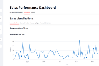
InData Visualization, Data Science and PythonbyAlan Jones·Apr 7How to Turn Raw Data into Insightful Dashboards with AIUse Plotly, Streamlit and Gemini to create visualisations without writing any code