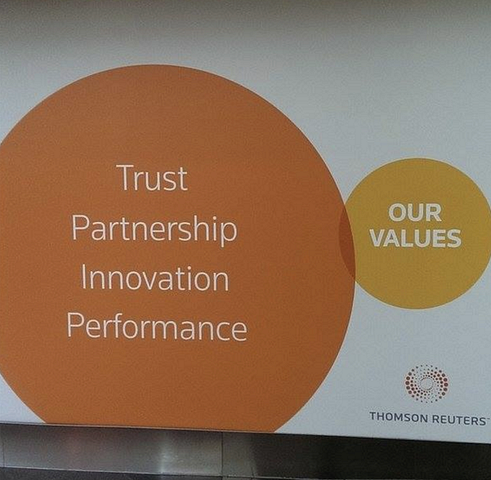
Here is a picture of a bill board snapped by a friend on Facebook. Venn diagrams are very useful in presentations. But there can be a catch.
I noticed this Tweet the other day of buzz words that are banned in the Conrad shop:
It is hard to put your pitch at the right level. I often see two types of mistakes:
The bar is rising in presentation design. More and more people know how to design decent slide, more and more people know how to explain a business concept visually.
The challenge that remains is often a very specific point. In most cases, this is the answer to an…
If this is the main message of your presentation, very few will believe you, unless you have a very credible explanation why you can offer a free lunch where others can’t. “It is like magic” will not cut it.
Image by Eva Peris
The standard cloud shape in PowerPoint is not very pretty. Especially if you need a different aspect ratio, there is no option but to stretch the shape, making it look even worse. My solution is to combine multiple cloud shapes into one to get a decent new shape (SHAPE FORMAT, MERGE SHAPES…
A question came in on Twitter the other day:
Analogies are great. You take a concept that anyone can relate to, and use it to explain something unfamiliar. But you can push it too far.
Social media is full of inspirational quotes, and some of them make their way into business presentations as well. I am not a big fan of them. A few nice ones from Quartz:
“By maturing, we self-actualize.”“We dream, we vibrate, we are reborn.”“Choice is the driver of…
I played around with the new “connectors” in my presentation app SlideMagic and used them to create a chart that visualises how multiple weak signals can come together into a strong one. I have added this chart to the SlideMagic template with charts that I…