5 Principles for Design in the Coming Times

With the increasing use of digital storefronts and experiences, the format of providing a meaningful experience to the users has and will continue to change.
Despite the need for digital and the already large scale implementation (prior to Covid), 97% of websites fail at User Experience at basic concepts like text legibility, task flow, so on and so forth.
This means an opportunity for product designers to step up and provide particularly in a time when they are summoned upon with the direst need, keeping business alive.
User experience has been proven once again to be in a nascent space, and there are still quite a ways to go.
With this in mind let us discuss certain principles that could aid with progressions in the field:
1. Transparency in business design:
Brand owners believe that increase in sales is not a measure of business success. However, it is the increase in customer loyalty to a brand. Transparency in the user flows, and design plays a vital role in building customer loyalty. 73% of the customers will willingly spend more on a product that manifests complete transparency. With people always sharing their opinions about products or values of the brand, it’s better to give them the information they seek and not keep them in the dark and make assumptions of their own.
While consumers want complete honesty and transparency from a brand, always use discretion when sharing information.
2. Factoring in brick and mortar CX:
With the increasing digitization, digital products and e-commerce have embedded themselves into people’s lifestyles. Crumpling of brick-and-mortar businesses seems inevitable. But that doesn’t essentially mean demolishing the retail store experience altogether.
Online businesses should consider leveraging in-store experience online, delivering the same quality and making it satisfactory for users.

For instance, Lenskart provides “trying on” feature for products online. It’ll ask them to scan their face from different angles, and then they can try several glasses in real-time, just like you would in its physical store.
3. Working on design at an atomic level:

Atomic design is a methodology that allows the designer to break up the entire User Interface into basic components and organize it, so it can be reused. These components are distributed into 5 distinct levels: Atoms, molecules, organisms, templates and pages. Atomic Design approach helps build a more modular and reliable design, making design teams efficient. It can even be scaled for larger projects, all there needs to be done is reassembling the components into web pages. By having a component library, all the components become reusable, prototyping becomes faster, and updating from design to development is simplified since the basis of the design, the atom, is firmly set in place.
4. Considering human retention and attention more keenly:
With constant information overload, user attention is becoming more scarce; Grabbing this attention is a more challenging task than it has ever been.

One possible means of grabbing user attention would be incorporating animations and microinteractions on to product flows. Microinteractions are beneficial since they create continuity while leveraging animation, thus making cognition simple and attractive.
Another great example could be employing “Progressive Disclosure” in the product. We’ve already spoken a ton about this topic, so go check it out on this link if you want to learn more!
5. Designing for the disabled = designing for everyone:
Accessible design produces a working product that functions for everyone, even the lowest common denominator of the user. Accessible design aims at achieving high product usability by incorporating experiences for all people, including those with visual, auditory, motor, or cognitive constraints.
Colour accessibility can be employed in the products for a better experience for the visually impaired.

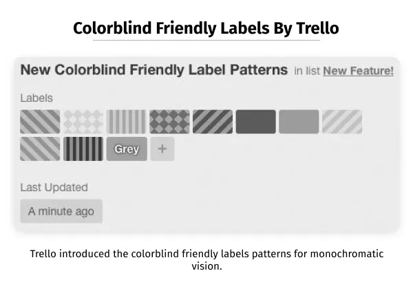
For instance, high-contrast text (which satisfies the W3C minimum AA rating), using icons/text for showing error/success messages or using textures and patterns for monochromatic vision.
Transcriptions could be made available for the videos/audios for users with auditory constraints. This could also benefit people watching the video on mute or the ones who don’t speak the same language as the one in the video. This way, it’s a design for all. Check out the extensive pieces google designers write about accessible design to see how pertinent a large company like them find this to be.
Final Thoughts
As dependency on the digital channels grows, both the quality and ethical implications must follow through.
While these principles enhance the User Experience (and potentially the User Interface), it also provides the window of opportunity to take a long hard look at the field for all its glory, reconvene, and provide new ideas and design that elevate the experience in product.
The Canvs Editorial team comprises of: Editorial Writer and Researcher- Paridhi Agrawal, the Editor’s Desk- Aalhad Joshi and Debprotim Roy, and Content Operations- Abin Rajan
Follow Canvs on Instagram and LinkedIn. Don’t forget to follow us here on Medium as well for more design-related content.
