Homepage
Open in app
Sign in
Get started
Tagged in
Design
Colourful Facts
Explorations in the field of journalism, data visualisation and content creation. Email at:
thomas@colourfulfacts.com
More information
Followers
58
Elsewhere
More, on Medium
Design
Thomas de Beus
in
Colourful Facts
Jan 8, 2018
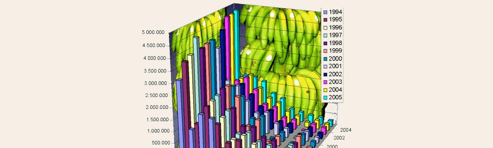
Redesign of a truly bananas chart
On Twitter, I stumbled upon this horrendous 3D bar chart. When looking at the data, it might have…
Read more…
4
Thomas de Beus
in
Colourful Facts
Jun 23, 2017
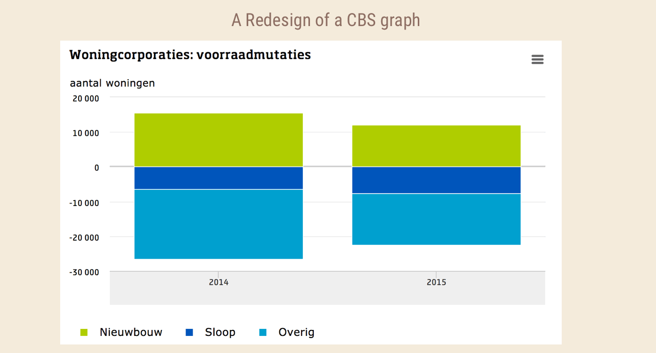
Is the Central Bureau of Statistics Creating Automated Graphs?
Read more…
Thomas de Beus
in
Colourful Facts
May 30, 2017
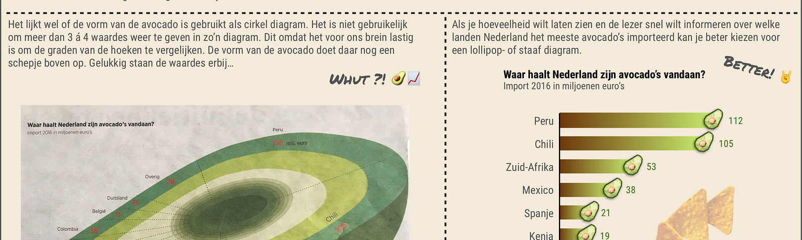
Use avocado 🥑 for guacamole, not as a diagram please
Read more…
Thomas de Beus
in
Colourful Facts
May 30, 2017
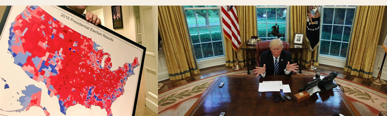
Trump should ignore this county choropleth map when showing election results
Read more…
6
Thomas de Beus
in
Colourful Facts
May 30, 2017
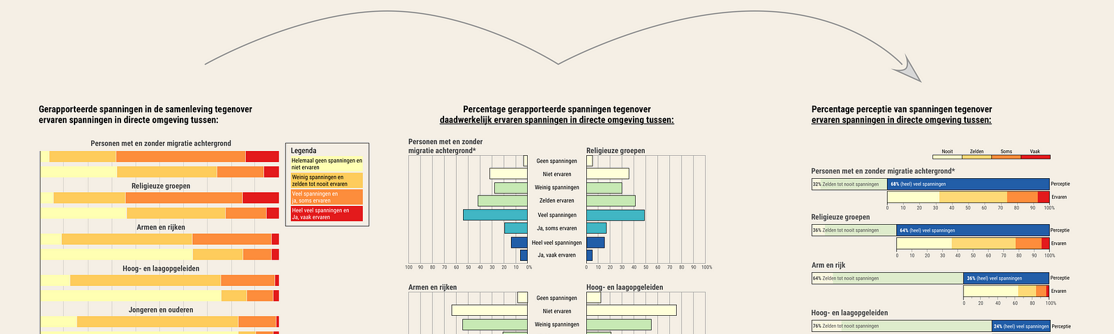
Huge gap Between Perception and Experienced Tensions in Dutch Society
Read more…
Thomas de Beus
in
Colourful Facts
May 30, 2017
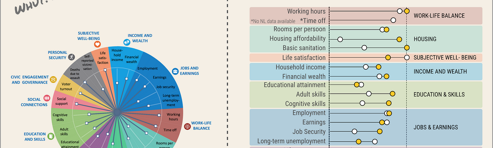
Crazy ‘Radial Pie Chart’ Shows the Quality of Life in #1 Denmark
Read more…
1
Thomas de Beus
in
Colourful Facts
Mar 24, 2017
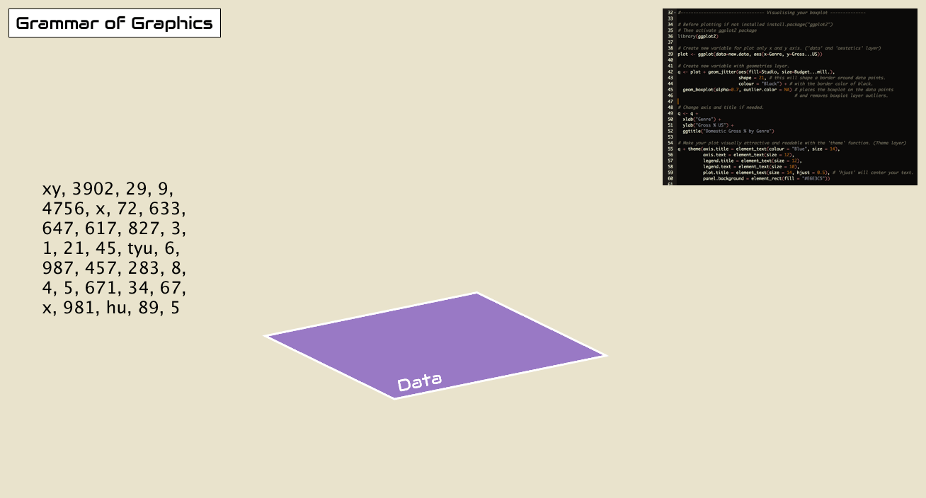
Think About the Grammar of Graphics When Improving Your Graphs
Read more…
104
1 response