Humanizing Data — Part III
Different Types of Visualizations
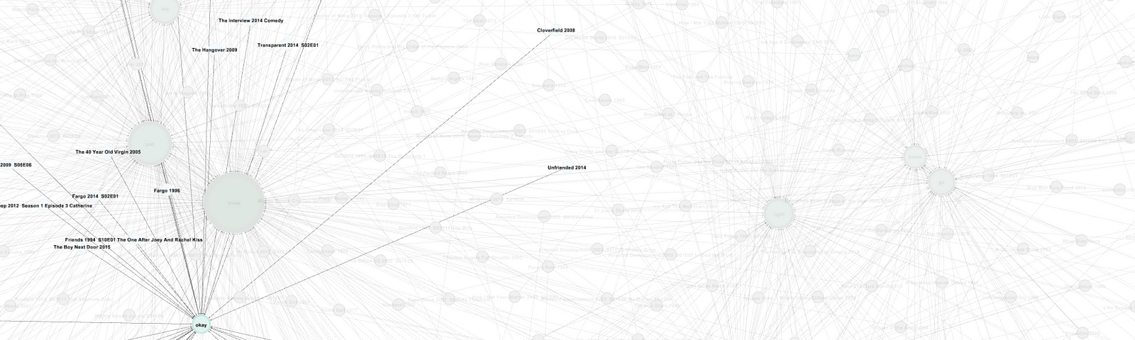
People learn and digest information differently. In addition to tables and (typical) bar charts, there are all kinds of ways to spice up your data. Here are some alternative visualizations to try: