Humanizing Data — Part II (Charts)
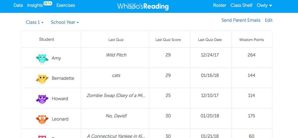
In Part I, we dove into tables. Charts, however, are a lot more graphical and can help make data clearer (and if done wrong, sometimes worse). Here are some tips for creating friendlier (bar) charts:
- Add horizontal lines. Adding horizontal…

