Video Game Typography Part II: Art Direction
This is a series of articles exploring the use of typography in video games, you can find the others parts right here :
- VideoGame Typography Part I: Effectiveness
- VideoGame Typography Part II: Art Direction
- VideoGame Typography Part III: Branding
- VideoGame Typography Part Four: Creating a font (Coming soon)
Introduction
When creating art assets for a video game its important that you make sure everything exists in the same aesthetic, this happens through the process known as art direction. The role of an art director is to look at the style of the environments, characters, animation, VFX and UI are of quality and are in balance with each other. For example, the art director would look at different ways you can texture a character, and design an environment in a way that they look like they fit together. You can’t have a photo-realistic character walking around in watercolor style environment it just wouldn’t make much sense.

Art direction is a jigsaw puzzle with many pieces that you have to solve except its up to you to define the shape and aesthetic of each piece. Figuring out how to best visualize the UI piece of this puzzle is tricky and even harder to make it fit with the rest of the game’s design. One thing that we can use to assist us in solving this puzzle piece is typography. In the same way, we use art direction in character/environment balance we do the same to harmonize the typeface with the visual environment (Icons, Graphic Design, VFX) of the User Interface. We are now going to examine 3 examples of typography in game UI art direction, and these are the 3 topics we will be discussing:
- TYPOGRAPHY IN PERIOD SETTING ART DIRECTION
- TYPOGRAPHY IN DIEGETIC ART DIRECTION
- TYPOGRAPHY IN SERIES ART DIRECTION
The examination of each of these examples will help us understand how typography can be used to enhance a video games aesthetic. So lets get started by looking at how the time and place of your video game setting can be reflected in your user interface by utilising thoughtful typography.
Typography In Period Setting Art Direction: Company Of Heroes

For as long as people have been making games, World War 2 has featured quite heavily as a setting for many titles. In fact, there are just over 100 World War 2 themed titles that are currently listed on Wikipedia and there’s a lot of 8-bit era titles that are actually missing from this list too. The majority of these games are either first-person shooters like Call of Duty, Strategy games such as Hearts of Iron or action adventure games such as Commandos. Many of these games approach typography very similarly but none really do it as well as the title we are going to examine now, Company of Heroes 2.

Company of Heroes 2 is a PC real-time strategy game that features an abstract UI style featuring bullet belts for loading bars, realistic medal icons, battlefield maps and military documents. The presentation on a whole of this title is excellent with great use of graphic design and typography that is not only balanced but is incredibly polished. But let’s examine the typography in this title that really helps push the world war 2 era theme.

You can see here on the loading screen below we have the bullet belt loading bar and then in the centre, we have a paper folder and a typed up mission description on top. The diegetic treatment of the mission briefing documents works quite well in setting the tone here and is greatly enhanced by the use of the typeface “Hermes”.
Hermes was used extensively in many newspapers and other publications in the early 1940’s as most of the readable materials back then had to be printed or typed. Hermes or similar looking fonts were used almost exclusively by the typewriter machines and printers of the day. These machines were also used by the military to create mission briefings and various other military documents. So when you read the mission briefings for Company of Heroes 2 the choice of font does help establish the period aesthetically.

By using the Hermes typeface the creators have done well in helping establish the World War 2 theme outside of the game world itself. This is a pretty basic example of how thoughtful typeface choice can boost the aesthetic effectiveness you want to go in your chosen period.
Typography Enhancing Diegetic Art Direction: LA Noire

The Rockstar games 2011 title L.A. Noire is set in 1940’s Los Angeles, where you play as a detective who sets out to solve a variety of crimes in the form of an open world 3rd person adventure. Playing as the detective you have to visit crime scenes to collect clues, follow up leads, and interrogate suspects. The technology used to capture the facial expression of the actors was incredibly sophisticated for the times.This technology was vital to the interrogation mechanic, as players must use the suspects’ reactions to questioning to judge whether or not they are lying.

As the player progresses throughout the game you jot down any relevant information the player comes across such as clues, alibis and even suspects’ body language in a notebook. This is where typography comes in to enhance the diegetic aspect of this mechanic; the clues are being jotted down by pencil and you can see the pencil style font on the in-game notebook. During play, I found that because of the representation of the information in this pencil style font it enhanced the game’s playability in a couple of surprising ways.
One factor was that due to the uniqueness of the pencil style typeface, it assisted me in being easily able to recall the information or pin point it in the UX (the notebook screen). And the permeable nature of pencil markings themselves reflected the reliability of the information I was jotting down. When these clues are edited down by the game’s writers and displayed in the notebook side by side with this typeface, they take on another context as potential lies, dead leads and misinformation.

This is of course how a real detective’s notebook might look like, but I do feel it has an enhanced effectiveness in a video game setting. This is where LA Noire differs from most video games, not everything told to the player is as clear-cut as it seems. Any information displayed in nearly any video game (character dialogue aside) is usually 99 % fact, system messaging, scores, controls etc. Designers have to be incredibly clear in all player-facing messages, as any confusion might lead to players making too many mistakes, and thus having an inferior experience, or worse yet, stop playing.
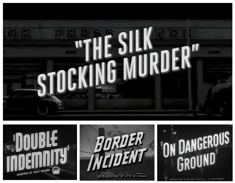
The subtle use of typography in L.A. Noire was put to good use to affect the way the player interprets information. Designers have to be incredibly clear in all player-facing messages, as any confusion might lead to players making too many mistakes, and thus having an inferior experience, or worse yet, stop playing. You can see that the various flyers and business cards you interact with have authentic period lettering. This helps set the scene, in a similar way to Company of Heroes’ usage of the font Hermes. But there is an inspired touch of great UI art direction present at the beginning of each case you take on. Each case has its own name and title sequence, that echoes the film noir movies of the 1940’s.
Typography in Series Art Direction: Alien Isolation

Alien Isolation (2014) is a survival horror video game that plays as a sequel to the famous 1979 sci-fi horror movie Alien. You play as Amanda Ripley, the daughter of the movie Alien protagonist Ellen Ripley. The game revolves around Amanda Ripley’s efforts to investigate the whereabouts of her mother, who worked on the ill-fated Nostromo space freighter. The game is set slightly after the movie but within a similar period so that the worlds are so closely visually aligned.

The designers at Creative Assembly have a bit of an odd case on their hands here, they are making a 2014 video game sequel to a 1979 Sci-Fi movie that’s set in 2104. This is not only tricky to explain, it’s also much more difficult to know exactly how to start building something like this, art-wise. So how they went about it was to establish a steadfast rule set by the art director:
“In order to stay faithful to the source, we set ourselves a rule that we wouldn’t build anything that couldn’t have been built on the original set in 1979. Everything in our game conforms to this retro-future aesthetic.”
Jude Bond Art director , Alien Isolation
The Alien movie production designers had to look at what technology was around them at the time and predict what would happen in 2104. And as long as the Creative Assembly developers stuck to their rule, they could perhaps view the future through the same perspective. The game art team could also directly copy some of the movie prop assets when they needed to, in order to directly correlate the worlds of both game and movie. This retro-minded ethos of the art team informed all aspects of the art direction from characters, environments, props and of course the UI.

Alien Isolation has the protagonist interact with a variety of different computer interfaces that use CRT screens that reflect the style of the of the original movies props. And these screens use simple HUD and very basic computer read out layouts that would have been the pinnacle of computer tech seen by the designers at the time.

By taking on this retro direction they have to almost completely ignore technological evolutions that we have today such as retina screens, motion graphics, and wide screen monitors. By ditching these high fidelity visuals for the screens they also had to find a typeface that would gel with the Lo-Fi Sci-Fi aesthetic.


It’s possible to see in these shots from the game, that the screens being displayed are of very low fidelity, and pretty basic in colour and complexity. The font is also very reminiscent of very old BIOS messaging or system dialogues from computers like the Amiga or the Atari ST. This is maybe why the typeface feels so genuinely authentic to the Lo-Fi vibe, but yet it works well on a high fidelity console output from the PS4. So what is the typeface used to establish this retro aesthetic?

The font is actually custom made specifically for Alien Isolation, named after the space station setting of Alien Isolation that is known as Sevastopol. Lead UI designer Jon Mckellan created the Sevastopol typeface font from scratch. Its simple, functional but unique to this game. I really liked the fact that the designers didn't just settle for the typeface that was closest to what they needed, they went that extra mile to create it. I myself have spent a long time on projects searching for the right typeface, and quite often you get what you need but not exactly what you want. The art team’s stead fast approach to the retro rule probably lead do this decision to create this custom font, in the same way that the movie production designers had to create a lot from scratch. It really does pay off as the entire game feels authentic to the original movie production design, from the environments, all the way down the the typography.

There is another fantastic retro touch I would like to mention that the UI designers put into the game, that for me really helped push the Lo-Fi Sci-FI feel. At moments during interactions with various pieces of tech in the game, you can see artefacts and distortion lines that flicker over the UI, and even within the game’s title sequence. This interference VFX was also informed by the art team’s retro rule and were created in a very inspiring way.

The ruling home media format in the 1970’s and 80’s was the VHS tape, this is how many people like myself actually watched the Alien movies (over and over again). A bit of a problem with the VHS format, is that it actually degrades after repeated use, and that could cause some seriously noticeable artefacts and distortion. The UI designers actually video taped the UI onto degraded tapes and then created glitches and distortion VFX based on the captured UI VHS images.
SUMMARY
When your game has strong thematic elements, and if appropriate you should find ways to have this resonate throughout all fields of the games aesthetic. One way a designer can do this is to reference the art direction of the game, using typography to enhance the game’s uniqueness and effectiveness. In Company of Heroes 2, we explored historical themes, and found that a little research into the area can help you find an appropriate typeface to set that scene. The careful attention to detail of typography in LA Noire’s diegetic elements actually enhanced the playability subtly.

Instead of settling, Creative Assembly used bold art direction to create their way out of a typographical issue. This attention to detail by the team was inspired, designers really should not limit themselves to what the nearest fitting typeface will do, if your UI needs something look into making it. Particularly important when it comes to typography in mobile gaming, as too many games only reference other titles to make decisions about what fonts they will use, regardless of genre or art direction.

Gaming typography I believe can work in a similar way as film title typography works, it can be used to reflect themes and concepts of the movie itself. In fact some films can be so intertwined with a typeface that it becomes an integral part of the identity of a movie. And this is something we will be looking at in the next part of this gaming typography series, how a font not only plays a role in the art direction of a game but can become a central pillar of a titles branding and identity.