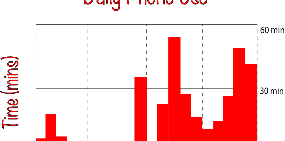
This graphic represents which parts of the day I spend on my phone. The x-axis measures the time of day starting at 12 a.m. and…
Data Visualization
This line chart represents the relative popularity of Google Search trends for three social media platforms over a 15 year period. The platforms I used are MySpace, Facebook, and YouTube. MySpace was…
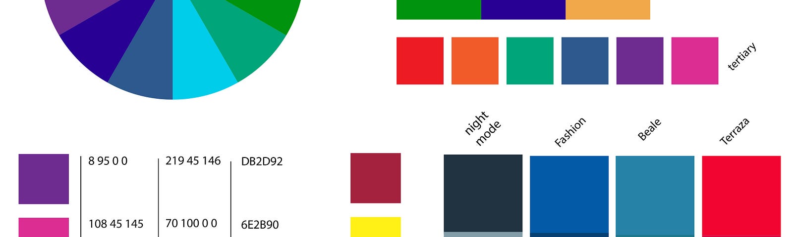
Color Wheel