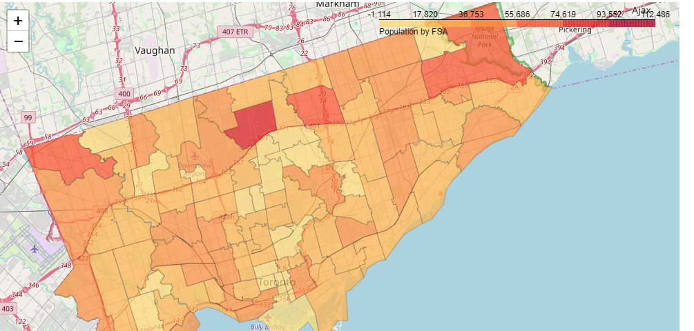
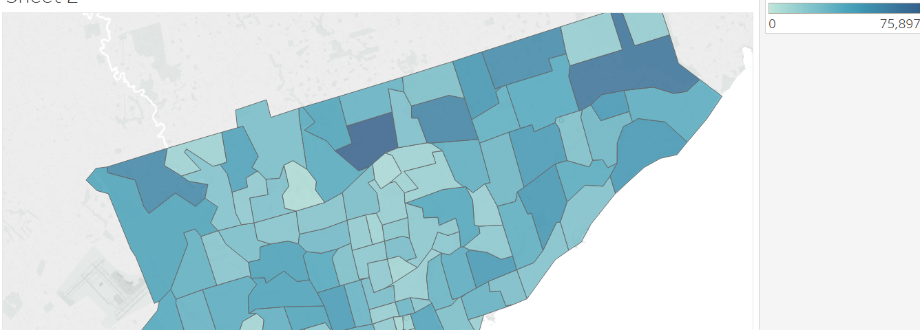
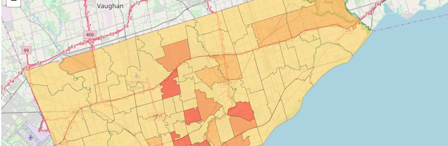
I wanted to create a Choropleth map for some Toronto data I have that is organized by FSA…
When you have a fairly large number of classes of data to plot, it can be hard to focus in on one class. Happily Altair provides a mechanism to use the legend to highlight only one class at a time.
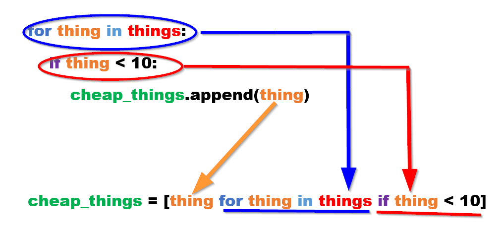
Coming to Python from other programming languages, I struggled at first to decipher list…