Regarding my blog post about Minard’s Visualization of 1812 check this update made in Tableau Public that made it interactive.
Answer: Facebook 45% of world wide web users went to it yesterday.. and it gets about 5% more than google.
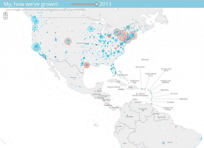
This map shows the growth of Kaggle community in North America. That is the submissions by Data Scientists to Kaggle…
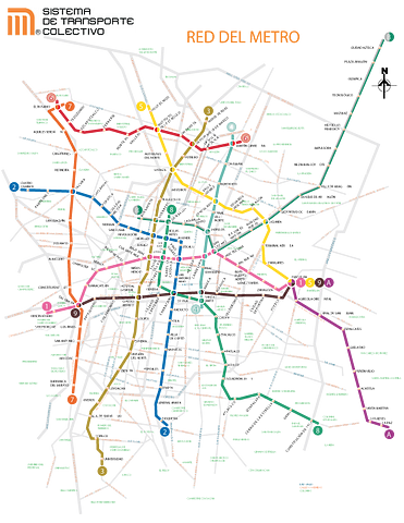
I just converted the Mexico City’.KML file to .shp format suitable for ArcGIS. To get the file click here
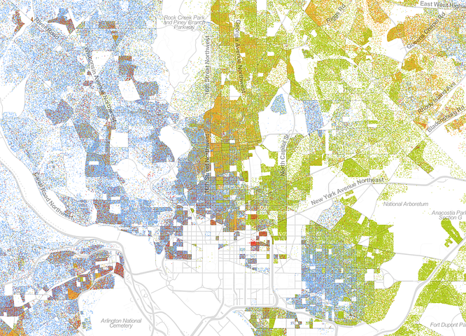
Checkout the interactive racial dot map here and their impressive methodology here. They also have a repo with the code.
Ash Maurya presents an excellent blogpost about product/market fit lean startups and validation. Some highlights:
“ .. .four stages to the customer development process as iteration loops with the following success end goals:
On the last couple of months students in Mexico have held protests against the elected president Enrique Peña Nieto. Their movement is called #YoSoy132. I am still wondering what the movement is about… On the one hand, they were related to another presidential candidate Andres Manuel Lopez…
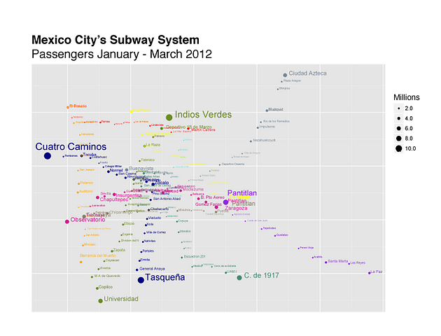
I used R and ggplot2 to make a bubble map of Mexico City’s Metro passenger count from January to February…
Many Wikipedia articles are tagged with geographic coordinates. Many have references to historic events. Cross referencing these two subsets and plotting them year on year adds up to a dynamic visualization of Wikipedia’s view of world history.
A history of the world in 100 seconds.
What the World Eats, Part I — Photo Essays — TIME.
Excellent opportunity to analyze people’s eating habits.