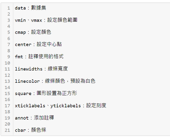
熱圖是一個以顏色變化來顯示數據的矩陣。簡單來說,就是用依據數字的不同,使用不同的顏色來呈現數據。
1.箱形圖又稱為盒須圖、盒式圖或箱線圖,是用來顯示數據分散情況的統計圖,因形狀如箱子而得名,適用於較大數據集差異的表現。
2.它能顯示出一組或多組資料的最大值、最小值、中位數、及上下四分位數。
3.箱形圖的方框會從數據的下四分位值延伸到上四分位值,因此可以看到四分位間距。方框內的水平線表示中位數,從框延伸的晶須(whisker)顯示數據范圍,可以顯示數據異常值(outliers),異常值通常…
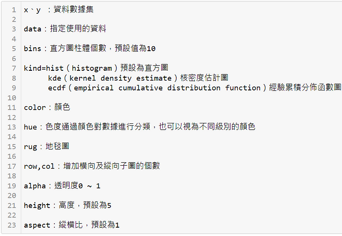
繪製分布圖的圖形界面,可繪製直方圖、核密度估計圖及經驗累積分布函數圖。
1.子圖的格式可以是一個子圖或是多個子圖共同存在一個圖中,因此可以多個子圖一起存在於單個圖中。
2.每個子圖都各自的x軸及y軸,figure可以通過plt.figure()來實現,它可以包含一個或多個子圖,默認包含一個子圖。
首先導入matplotlib.pyplot、numpy及pandas,並執行%configInline Backend . figure_format =…
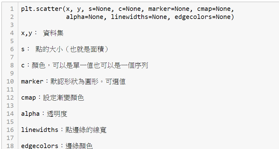
1.散點圖非常適合顯示變量之間的關係,可用來可視化一個或多個組的兩個變量之間的相關性。
These were the top 10 stories published by Python 商業數據分析; you can also dive into yearly archives: 2019, 2020.