總是為了更好的未來而換工作,卻又重蹈覆徹栽進工作不順心、總覺得哪裡不對勁的循環當中嗎?其實,很多時候一份好的工作需要耗費更多時間尋找,而一份優渥的資源也需要你去爭取掌握。如果你總是沒有想清楚自己面對多份機會誘惑時,該整理好的機會成…
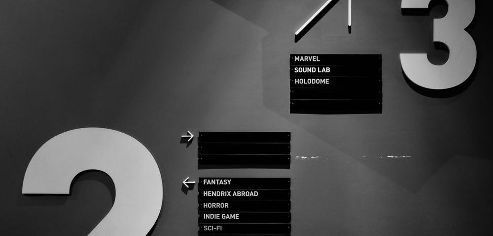
你可以說它是"利用心理學去完成視覺導引或規劃的一種方式"
照片一向是網頁中不可或缺的角色,可以用來描述情境、創造和消費者間的親切感、提升品牌價值等等。
「比起 Facebook,我更愛 VK。」這種話就是從我口中說出來的。
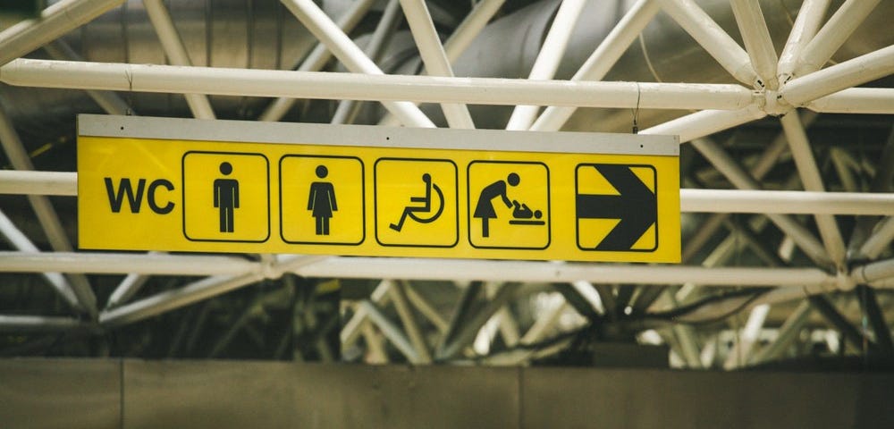
色盲聽起來是個很有距離的名詞,事實上色盲者的比例佔了全部人類的8%,如果把色弱者算進去恐怕多更多。最知名的例子,像facebook創辦人祖克伯就是紅綠色盲,甚至很多藝術家和設計師都是色盲或有色弱的情況。
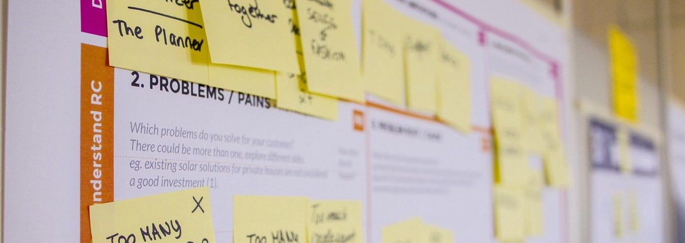
繼上一次學完基礎理論與特徵,這一次我們要來了解如何將他們運用在設計上囉!
你可能修過色彩學,但色彩心理學卻是更多企業御用設計師不會特別說的秘密。如何用顏色讓你覺得它看起來就是間超專業的快遞公司?你知道所有餐飲界都喜歡偷偷裝潢這個色彩?
藍色、綠色、紅色,別讓政治干預了設計人該使用的配色法則!
如何使用正確的色彩計畫讓色盲者或其他族群都能清楚看到重要的標示,才是整個社會應該努力的目標。