Times New Roman was designed by Stanley Morison for the Times of London newspaper, in 1932. The font was first used in the newspaper in 1932, and later made available to public in 1933.
For my exploration of typographic voice, I chose the word “purity.” To me, purity is simple, clear, and cohesive. It feels patterned, without many flourishes, but that does not preclude serif fonts.
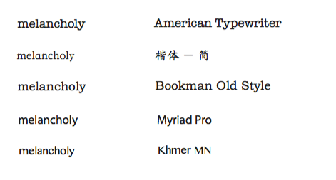
In order to discover how different typefaces affect the meaning and emotional feeling of words, I explored changing the font in order to properly convey the word “tradition.”
Tradition, to me, evokes the past, especially things that have lasted a long time that I…
Stencil STD Bold conveys “Supreme” by having a hefty weight as well as typing in all capital letters. It is reminiscent of the stenciling typeface the Army uses, therefore promoting physical strength and superiority.
Eric Gill created Gill Sans (the “Helvetica of England”), drawing inspiration from Johnston Sans which was designed for the London Underground in 1913. Gill first experimented when he hand-painted lettering for a bookshop sign in his hometown, Bristol in 1926.
Typeface: Helvetica
Typeface Designers: Max Miedinger & Eduard Hoffmann
Year designed: 1957
Helvetica is a widely used sans-serif typeface developed in 1957 by Swiss typeface designer Max Miedinger with input from Eduard…
Name of typeface: Baskerville
Name of designer: John Baskerville
Year it was designed: 1754
Name of typeface: Futura
Name of typeface designer: Paul Renner
Year it was designed: 1927
1 or 2 paragraphs about typeface and purpose of its form:
The severity of the straight lines, pointed edges, and extremely thick lines visually mimics the gravity and pain…
Name of Typeface: Baskerville
Name of Typeface Designer: John Baskerville
Year: 1754
Baskerville, designed in 1754, is most known for its crisp edges, high contrast and generous proportions. The typeface was heavily influenced by…
By tracing the various fonts and typefaces, I gained a physical understanding of the difference between the serif and sans serif fonts, as well as the distinctions between typefaces. Adobe Garamond and Didot, while both serif fonts, convey different emotions. Adobe Garamond is a robust typeface…
Name of Typeface : Gill Sans
Name of Typeface Designer: Eric Gill
Year: 1928
Having helped Edward Johnston with his iconic typeface, Johnston Sans, Eric Gill set out to create the perfect, legible typeface, since he was not…
Font choices and explanation:
Adobe Garamond is a serif font with bracketed serif. I found the bracketed serifs and high contrast difficult to trace, especially the ‘g’ and ‘a’, since I almost never hand write those two letters in this style. I also noticed that the top part of ‘g’is smaller than other x-height…
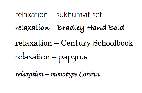
When I think of relaxation, I think of two things. One, elegance / symmetry. And two, lazy / fluid. I distributed the typefaces…
The word I chose was “future” and below are the 5 typefaces I felt expressed it best.
Name of Typeface: Times
Name of Typeface Designer:Stanley
Year: 1931
In 1931, The Times of London commissioned a new type design for the body copy of the paper. The design process was supervised by Stanley…
This activity made me really aware of the impact of contrast, especially since my font for the project is Didot. I really felt…
Typeface Research
Chalkduster communicates “organic” well because as suggested by the font name, it uses a rough texture and intentional flaws (such as the gap in g, or imperfectly circular o) to imitate handwriting on a chalkboard. This imitation of chalk suggests a more intimate connection to…
Using typefaces to express the word “relaxation”
This was one of the typefaces I first chose when looking for one to express the word relaxation. I feel like this typeface helps to convey a more fluid, smooth and relaxed feeling since there are a lot of connected curves…
Typeface Tracing
This assignment allowed me to notice the impression of line weight. Garamond was very natural because the line weights of each…