See what People have created with Gravit Designer #7

It’s that time again: time to showcase the wonderful designs our users have been working on. With the release of version 3.5 and the new rendering engine, we hope to provide, more than ever, a great experience for everyone, and be able to continue sharing here the work the community creates.
Don’t forget to check the previous articles to see more designs created by our users (part 1, part 2, part 3, part 4, part 5 and part 6).
Alex Bonini (aka “BuonHobo”)
Links: Twitter
I am a student and a tech enthusiast. I started using computers before even learning how to read. I guess I just used to look at the images and press random buttons hehehe, I didn’t say I was good at it.
I like to spend my free time playing video-games, reading tech news and, since I discovered Gravit Designer, making logos and vector portraits.
Project: Space lady

This is the drawing I’ll help you recreate, it might not be my best one but it can give you a pretty nice idea of how I use Gravit Designer.
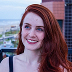
Step 1: Pick a pic

It’s very hard to draw a realistic human in a complex pose with simple shapes and solid colours, so you can follow my example and start from an existing picture (this is a friend of mine, she was happy with the result).
Step 2: Make a vector portrait out of it
You’ll need to use the Pen tool in order to make a vector version of your picture:

You can either do all the curves at once or you can pick some spots and do the curves later with the Subselect tool. You can also draw no curves at all and keep it “polygonal”. Your creativity, your choice.
Zoom in the picture until you’re comfortable with it and start working. This can take a lot of time, you decide the level of detail and style, what matters is keeping it consistent.
This is how it should look:


Don’t worry if somethings don’t fit or are not the way you imagined them. You can change anything in any moment, as this is vector graphics. Use the ”clip” feature to fill a shape with multiple colours.
Keep it tidy!

See the bar on the left? Keep it tidy, you wanna name everything and keep it in order using the “group” feature or you’ll have a very hard time finding elements in complex projects.
Step 3: Add a background

When you are satisfied with your portrait, proceed and add a background, be creative! I borrowed those planets from a project I worked on some time ago, but anything else is simple to create!
Why I like Gravit Designer
I like it because of how simple it is. The UI is one of the most intuitive and polished ones I’ve seen, you can do pretty much anything with little to no knowledge of the program.
I literally started making portraits like this one the day I downloaded it.
Another thing I like are the developers, after seeing my work they immediately asked for feedback, this really tells a lot about how devote they are to this program. This community is really something I wanna be a part of.
Sam ‘McGee’ Froelich
Links: Twitter | Instagram | Facebook
I’m a freelance illustrator with a flair for creating vivid illustrated characters reminiscent of the visual illustrative look of the 1950’s. In the past, I’ve worked with Photoshop and Clip Studio Paint, but on discovering Gravit Designer, I have found an application with tools which are easy to work with and allow me to produce truly animated designs.
With the introductions out of the way, let me show you my process for creating a character illustration using some of the basic properties found in Gravit Designer.
Step 1: Outlines

Once I’ve drawn some rough sketches on paper in my sketchbook, I open up Gravit Designer and choose the ‘Pen’ tool. The ‘Pen’ tool is honestly the one thing I could not live without in a vector program, so I was really happy when I discovered that it works almost identically in Gravit Designer as it does in other applications. I want to make my designs feel animated by keeping the lines nice and curved and exaggerating the form. Once I’m happy with the shape and adjustments have been made, I choose a main hue from the colour palette. For this character, I’ve gone ahead and chosen a nice lime green.
Step 2: Designing the mouth

Now that I’ve created the main shape of my design, I start adding details such as the mouth. Choosing the ‘Pen’ tool again, I create the shape. Once happy with it I then grab the layer from the layer options and place it at the bottom. This allows for the shape of the mouth to still be visible, but removes the rough edging that I produce. From here I continue to use the ‘Pen’ tool to design the teeth, creating a single shape which I then Copy/Paste and duplicate multiple times. After that I create the tongue.
Side 3: Bite marks

Now we get to one of the fun features that Gravit Designer offers. I’m going to create some bite marks for our zombie. First thing I’ve got to do is choose the ‘Circle’ tool from the options. Then I’ll create a variety of different circular shapes, making sure each one is scaled differently and placed closely together, but also keeping a few separate from one another. This is so the ‘bite’ has a more interesting presentation. The nice thing about this section is that I don’t have to worry about adjusting the hues of the circles, since we will be using another feature to complete the look.
Step 4: Creating the Bite

Once I’m happy with the presentation of the bite mark, I then choose the ‘Select’ tool and highlight the layers. It’s important that I only select the body of the design and the circles. With this done, I then head up to the options and choose the ‘Subtract’ tool. By choosing this tool, it will remove the top layers and create an outer layer of the shapes we used, merging them into one compound shape. This also allows for anything that we layer underneath to be visible.
Step 5: Final look

Now we have a nice looking bite mark on our zombie! We also have a variety of options we can now explore if we want to. We could feature a brain that we could design and place underneath the layer, or we could also alter/duplicate the layers of the compound shape to add an extra layer of shadow. For this design though, I plan to keep it pretty simple, since I want the rest of the design to have stand out appeal. With some further experimentation, this is one approach that I’ve found to be most helpful. It’s a great addition which makes Gravit Designer stand out.
Step 6: Facial Features

Going back to the ‘Pen’ tool, I’ll start to add other facial features such as the eyes, hair and eyebrows. I try to get pretty creative with these aspects, playing around with the shapes to develop something that reflects a sense of personality. It’s a good chance to experiment, trying different things to see what works best for this design. Once I’m done playing around with these elements, it’s then time to move on and add the clothing.
Step 7: Designing the T-shirt

Using the ‘Pen’ tool, I’ve created the shape of the T-shirt following the form of the body. Afterwards, I’ll add some minor rips and tears to amplify the look. I’ll also add some flair to the presentation of the T-shirt with some simple stripes, using the ‘Pen’ tool to create these as well. Once everything is placed and I’m happy with it, I will head over to the layers menu, hold ‘Shift’ and manually select the layers of the T-shirt and the three individual stripes. With these four layers selected, I’ll then head up to the options above and select the ‘Clip’ tool to merge them into one compound layer.
Step 8: Trousers and legs

Just like the T-shirt, I’m going to approach the legs in the same manner. Using the ‘Pen’ tool to create the design of the trousers, follow the base of the main body and create the shape of the trousers and the trouser legs. Since this is a charming undead fellow, we want to visually show this by the way we approach the legs, curving them inwards and keeping the joints nice and bent. This will give the overall effect of our character hunching/slouching, giving the appeal of a creature that is limited in their movements. Additionally, I’m going to tear one of the trouser legs, simply creating jagged edges at the ends. This will match with the rest of the ‘ripped’ design by giving them a jagged appearance, better signifying being one of the undead. Lastly, I’ll create the rest of the legs with the ‘Pen’ tool, layering them underneath.
Step 9: Arms and final details

Now on to the final steps to complete this illustration. I’ll create the arms with the ‘Pen’ tool, playing with the form to produce vibrant/animated illustrative features. We want to make these parts just as expressive as the rest of the design, using strong curvaceous lines and exaggerated form which will add a touch of humour to the presentation. Once I’m happy with the design, I’ll spend the remaining time adding or changing elements to make the character ‘pop’. For this illustration, I went ahead and included some extra details under the eye, around the mouth and the face, adding anything that could amplify the charm, but also the personality of the character.
So there we go. We’ve created a nice charming little zombie that I will save and then ‘Export’ as a 300DPI PNG to share upon the world of social media. I hope you’ve enjoyed this brief tutorial and that it touched upon some of the creative wonders that one can be produced with Gravit Designer. If you’d like to see more of my illustrative works, feel free to follow me on Facebook, Twitter and Instagram.
Muhammad Iqbal
I am a student in a vocational school in my city. Sure, I like to design anything if it’s interesting. However, sometimes the will to design fades because of expensive softwares. Fortunately, I found Gravit designer. It did not take me long to learn and master the software, because the UI is easy to understand and similar to other softwares I’ve used before.
I am graphic designer at Radiomuslimjogja, an Islam based radio streaming. I first met Gravit designer when I was almost graduating from my vocational school. It helps me a lot with my school projects.
Project: Jelajahi Angkasa Landing Page
This project is for a landing page that informs what the website has to offer. I don’t know how to code to create a full working website, although I know a little about web programming. I got inspiration from some awesome artists at dribbble.com, and I was just like “Hey, that is awesome, I will try to create my own!”.
Before I started, I downloaded some PNGs from kisspng.com.

Step 1
Create a new design at 1600x1200px, or any size you want to fit your project. Import the image to your canvas, resize it to make it larger and then blur it.


Step 2
Create a rectangle, make the corners round, and add a drop shadow effect. The background is just a detail for my design, it will not actually be used on the website.

Step 3
Create a shape with the Pen tool and add an inner shadow. Now, combine this shape with the rectangle, clipping them together.

Copy the Pen tool shape 2 times, and arrange the shapes, so that they look like this:

Step 4
Import the space and sun flare images, and clip them to the rectangle. It will look like this:

This is how my layers panel looks by now:

Step 5
For my website’s title, I wrote “Jelajahi Angkasa” (“Explore the space” in Indonesian). Convert the text to path, import the space image again and clip it to the text.

Step 6
Now, add the astronaut image, and place it on top of all the other layers.

Step 7
Create a description for the website. I also added a “Go” button.
For the button, create a rectangle with rounded corners, a gradient and drop shadow. Clip the same background image and the astronaut to the rectangle, resize it and it will look like this:

To make it more similar to a real button, add a rectangle with same size in front of it, use a gradient white to black, and change the blending mode to “soft light”.

Create another rectangle following the same steps as before, but add just black as the color, and change the blending to “soft light” to make it darker.

To finish, add some placeholder text.

Working with Gravit is really fun. Beginning designers can easily use it because the UI is easy to understand.
And what I love is the community, especially the developers. They are helpful and friendly, they try to listen to the community to decide what is best for the app. Maybe Gravit will be a hit software in the future. I would love to see that moment.
Just a glimpse …
That’s not all yet. People have created countless more designs recently. Beware, there’s a boatload of images ahead …