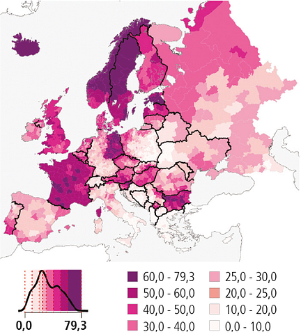
An interesting image went around Twitter this morning. It’s a map of the share of births outside of wedlock in Europe.
We’ve got new ACS migration data! So what does it say?
Well, as always, we start with the headline migration numbers.
Longstanding readers know I’m very interested in estimating good data for actual migration flows, which is harder than you might think. And sometimes it’s harder than…
Today I want to publicize a good paper I read recently. A new paper at NBER by Michael Haines tries to build a thorough and consistent time series of U.S. vital statistics for demographics back…
One of the most interesting pieces of studying migration to me is the actual movement data; cases where we’ve got tracking of how people actually move from place to place. Domestically, we’ve got pretty limited data on that. But internationally, thanks to data generated by the…