People learn and digest information differently. In addition to tables and (typical) bar charts, there are all kinds of ways to spice up your data. Here are some alternative…
By now we are pretty much used to data being everywhere (and expect such). Data should be presented…
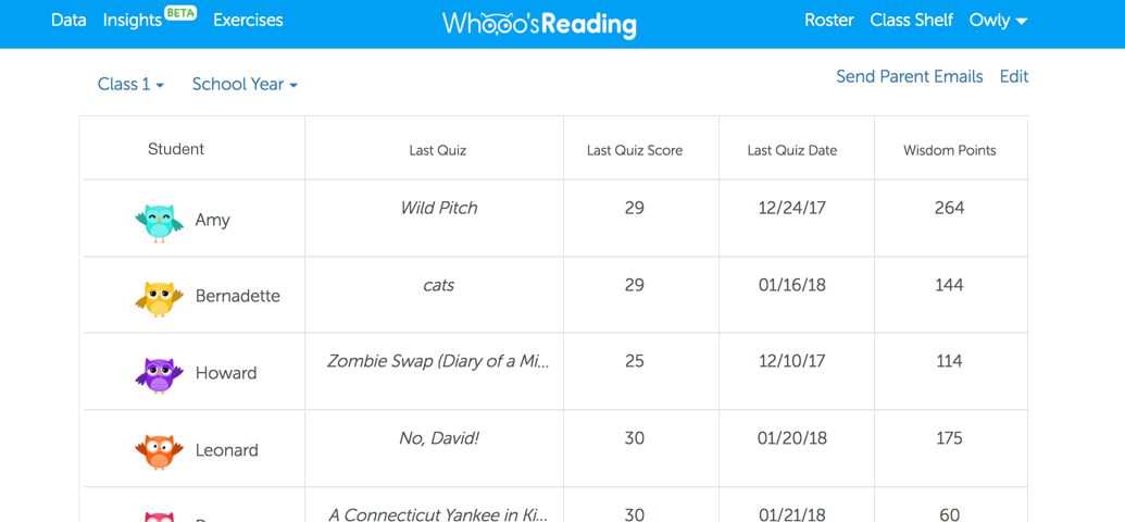
In Part I, we dove into tables. Charts, however, are a lot more graphical and can help make data clearer (and if done wrong, sometimes worse). Here are some tips for creating friendlier (bar) charts:
People learn and digest information differently. In addition to tables and (typical) bar charts, there are all kinds of ways to spice up your data. Here are some alternative visualizations to try: